Sunday 12 December 2010
Screen Shot 1: Importing File
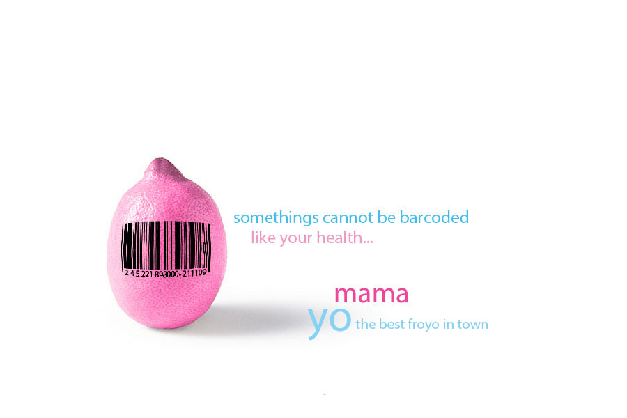
In this screenshot, the 'Yo Mama' JPEG file has been imported into the Google SKP model and scaled to the size in which it will be put onto the cup.
Implementation of Design on Google SKP
Monday 22 November 2010
Second of Two Poster Designs
Here is my second poster design; focusing on a more mature audience with the simplicity of black and white. Though effective contrast, this draws the audience and customers into the poster. Typography plays and important role as it navigates the customer around the poster. As Yo Mama emphasizes on health, the lemon created earlier is posted in the poster and the catch phrase "Some things can't be barcoded...like your health" is put into use in this poster. To create the black and white effect, I altered curves,overlay and luminescent settings on the layers to generate the effect.
This poster all in all is generated to involve a maturer, older audience.
Sunday 7 November 2010
Final Cup Design on Sketchup
After receiving Ivy's advice, I have decided on a cup to bring forward along with the advert package. The simplicity of Cup 4 (From the Left) brings an all-seasonal and multi purpose cup, yet redefining design as the form factor is simple yet different from conventional cups. There is a slot all around the cup for clipping in a spork (spoon and fork) and also holding some tissue so that the customer only needs to use to worry about holding the spork and the cup and not an extra tissue. Also, when the customer is on the move, they could clip the spork and tissue back in and easily carry around the froyo cup with ease.
For the Server: Furthermore, the rim or the top of the cup is wider than the bottom so that there is leeway and more space for the server when sprinkling the toppings, as current cups have narrower mouths; which leads to the server being more tedious and less efficient when there is a high customer demand at certain times of the day. As the bottom of the cup is deep with a smaller diameter of the cup, most of the froyo can be contained there and the top or wider bit of the cup can be used for plainly toppings or more froyo if needed.
Snapshots of the Cup in Sketchup 8:
Monday 1 November 2010
One of Two Final Designs for All-Season Advert Purposes
Here is my first final outcome based on Ivy's advice to make the poster suitable all year round. This is part 1 of the advert package (poster 1) and incorporates the use of Yo Mama's corporate colors of pink and baby blue. This is immediately recognized when put inside a store as the interior design is styled to fit the colors. Furthermore, a background repetitive pattern is used to emphasize and draw the eye in. I used Illustrator CS3 for the pattern and used the line tool to create triangles and made multiple of those. Once they were put into a row, I copied, rotates and pasted them to give the alternating zig zag effect. Patterns are universal and are effective across all age ranges.
For the text, I used photoshop to merge the vector and text together. The spilled milk symbolizes that the froyo is not just milk and that it is BETTER. Since "Yo Mama" is a pun, it is used in the advert scheme that promotes the viewers to actually o down to the store to se what is different about Yo Mama's Froyo and milk. Lastly, the "rawr" logo previously seen has been implemented into the design through "luminescent" effect to make the logo blend in.
Monday 18 October 2010
Client's reply and constructive criticism on initial designs
Tuesday 5 October 2010
Mmmmonster- Froyo Serving Cup Redesigns
After collecting ideas, 6 outcomes have been produce as I wait for Ivy's response to the poster designs. The six designs all have a concentration of their form-factor being less cylindrical and container like- yet able to contain the yoghurt and toppings without spilling over. Secondly, grip has been though about in the designs, ensuring that they won't slip out of the customer's hands. Lastly, 2 cups have slits in their design to slot in the forks and napkins so that the customer would not need to go though the fuss of holding the cold froyo with a napkin in the other hand as everything is stored into one. Since there is time, one of these designs will be taken forward to be a part of the advert package with a redesign of the froyo cup.
Below is a screenshot of the Designs:
Monday 27 September 2010
Research work in the meanwhile... Cup Designs
website: http://www.crookedbrains.net/2010/01/design_29.html
Some creative phrases or catch phrases are also useful on the cup to make the customer give more credit or think about the branding of the company? i.e a joke could boost the companies receptors?
Sunday 19 September 2010
Initial 3D CAD Visualizations for the Cup
Sunday 12 September 2010
Ivy's Email Reply-Improvements for Final Design
As Ivy is my client, I have finally received some feedback after the design proposals have been sent off to her. Above are screenshots of the communication between myself and the client. However, her response did not explain what I needed to do to improve it, therefore, another email was sent out so that she can make a response to the designs.
Tuesday 31 August 2010
Design Presentation
Sunday 15 August 2010
Summer Update
Over summer, I have not only been waiting for Ivy's reply, but analyzing existing MTR billboard adverts and adverts on buses and around town. Here is some analysis of existing products.
The photo above shows a Sony Ericsson billboard on a building in Mong Kok. Large scale posters can be really effective due to the large visuals of text, imagery and color on a plain cement/building colored background. However, this can be quite expensive for a smaller company, and less renowned businesses. Therefore, this format of advertising would not be feasible for Yo Mama. An alternative is MTR Billboards, posted around certain MTR Stations in Hong Kong. This could be a way forward for Yo Mama as JCDecaux statistics shows that:
"MTR advertising delivers a quality audience:
Young - 61% of all 15 - 24 year olds travel on the MTR.
61% of all 15 - 34 year olds travel on the MTR.
Better Educated - 58% of all people educated to a post secondary level or above, travel on the MTR.
More Upscale - 73% of all people earning a monthly personal income of at least HK$20,000 travel on the MTR."
As Yo Mama has a large target audience range, this idea can really boost their commercial reception also due to the passenger flow of 2.8M people per week and the MTR's 54% coverage rate in Hong Kong.
As researched earlier, there are a few options for smaller businesses, such as JCDecaux's 4 sheet panel to in-train cards.
For Mocking up the display, JCDecaux has a website that has photos for potential clients to use as mockups. http://www.jcdecaux.com.hk/asp/Libraryformatofad_subtopic.asp?Action=VIEW&MainTopic=Topic&TopicID=C2
Sunday 25 July 2010
Another Email to Ivy and Her Response
Saturday 3 July 2010
Over Summer and Y10 Progress Review
Thursday 24 June 2010
Designs of Posters (Idea 3: Yo Mama Monster)
Sunday 13 June 2010
Designs of Posters (Idea 2: Yo Mama Clouds)
The following designs go for a more creative and child oriented approach through using the idea of Fro-yo in clouds and color to convey to the audience what the Brand is really about: Having fun and fun through health. There is also an emphasis on the Yogurt's lower cholesterol levels and their avoidance to use artificial flavors and colors. Notice the change in the catch phrase in the 2 designs. Personally, i find both of them visually striking through the uses of the background cool and foreground/text warm colors which brings out the text.
Saturday 5 June 2010
Designs of Posters (Idea 1: Lemon Barcode)
Friday 28 May 2010
Reconnection with the Client
Thursday 27 May 2010
Poster Design Developments
The scan shows initial development of ideas which will be taken into account through it's presentation as a digital vector file. This will reflect the programs I have used to create the adverts and will also show my relevant skill in using Photoshop and also Illustrator.
These initial designs take aboard expressing Yo Mama's brand identity and target market as a broad age range through visual media.
Sunday 9 May 2010
Slight Project Adjustment
Collection of Billboard and Advert Analysis
On my own experiences as a potential customer, the escalator billboards down the MTR are quite effective as there is nothing to do, hence catchy information and bright colors bring the customers eye to the poster when the escalator slowly goes up/down. Even though they are small, they can catch the most attention as there are no huge billboards nearby and for small companies, theses are more profitable and create a more financially stable investment into advertising. However, the trackside billboards create a large promotional surface where it could have a potential advantage of attracting customers from a further field of view. But for a smaller comapany, it may not be the most affordable solution.
Apart from MTR Billboards, Bus adverts and Bus stop adverts also provide a moving advertisement where the ad can be brought along the way the buses operate; creating a visual showcase of graphical and interesting adverts. These however are quite expensive as it will cover all lateral and internal spaces of the bus creating a costly, but effective promotion.
Plasma TV Adverts create more oppurtunities and designs of which a company could adapt through digital media in which presents a more modern image and corporate brand which is useful for consumer and other electrical baased IT Service companies. Also, the moving images create an imapct to the audience which they are attracted to due to the animation. But, this may be quite expensive and according to the price charts (To be attached below) it shows the price listings of the adverts.
http://www.jcdecaux-transport.com.hk/mtr_format_details.html
Hence, in conclusion, I will create an in-station billboard which is one sheet across; either the concourse 4 sheet or 12 sheet layout as the MTR has a high passenger flow and will be visible from the by-passers with ease
Tuesday 20 April 2010
More Pictures Involving the Exploded Cup!!
Sunday 11 April 2010
Yo Mama Cup Dimensions and Investigation into Materials
The packaging of the cup has just arrived, detailed analysis will be conducted here.
From the cup that Ms.Lai had kindly donated, the exploded dimensions and photographs are attached below for the creation of the Corel Draw File as the Template.
Base: Circle
Radius: 4.5 cm
Diameter: 9 cm
Circumference:28.27...cm
Cup Height: Arc
Height: 8 cm
Length: 29 cm
There is also a reinforcement which utilizes 1 cm of the height for the rim in which created a more sturdy cup for the user. Also, there are more than 2 glue tabs, in which could be changed into slit locks etc, which can be a con of this design. Below are photos of the exploded cup model and the cup before the de-construction:
These photos depict in REVERSE chronological order:
1) The cup on a lateral axis
2) The cup at an angle displaying the depth of the cup
3)The cup with the rim rolled up (removed)
4) The cup deconstructed template
5)The 2 separate components that make up this cup
Sunday 4 April 2010
Some Exploration of Ideass! (:
Experiment 1: Color contrast and the emphasis of neon like theme colors + lime green
With this experiment, I utilized both Photoshop for the background patterns and Illustrator for the text and brushes to create a color contrast/ playing with color look to this experiment. The patterns in the back make the experiment look more textured and more interesting for the audience to look at and there is a HIDDEN COW (:
Thursday 25 March 2010
ICT IEA Diploma: Survey and Collation of Data
Most Effective type of Advertising:
In-Shop Display-4
MTR Billboard-9
Stand-Drag Poster-2
Reversal Advert (Advert facing the inside of the shop-2
Flyer Promotion-3
Most interesting/What you are drawn to on an advert
Color-8
Graphics-5
Resemblance-0
Real-life image-2
Font and Typography-5
Size-0
How often do you eat Frozen Yogurt?
Daily-3
Once a Week-15
Once a Month-2
Never-0
When do you normally eat Fro-yo (Time of Day)
Morning (0600-1200)-2
Afternoon (1201-1800)-10
Evening and Night (1800-0000)-8
Which Season would you eat Fro-yo the most?
Winter-3
Spring-3
Summer-8
Autumn-6
From these results, it provides me a guideline to when the advert should be posted up and what time there is a gap in the market in which could promote more people to come to eat Fro-yo at Yo Mama; or example- The morning? It could be a great morning boost with it;s nutrients in Fro-yo
Monday 15 March 2010
ICT IEA Diploma: 3.2 Requesting the dimensions of yogurt cup currently in use
ICT IEA Diploma: 3.2 Input and Output Requirements
The Input Requirements for a Poster are:
Graphical Images of the new flavor
Color to evoke corporate image
Text for brief info on the product
Address of shops and contact information
INCLUDE THE COW GRAPHIC!!!
The Output for the Poster Are:
An Adobe Illustrator and Adobe Photoshop File
An A3/A2 Sized poster available for print and display in shops
The Input Requirements for a Cup Graphics are:
Has a graphical connection to the poster
Graphical Images of the new flavor
Color to evoke corporate image
Text for brief info on the product
Address of shops and contact information
INCLUDE THE COW GRAPHIC!!!
The Output for the Cup Graphics are:
An Adobe Illustrator File
A Net of the cup with the graphic printed onto it for promotional and normal uses for serving customers
The Input Requirements for the Video Clip are:
Have a physical graphical representation and cross-links to the poster and cup
Cow "moo" sounds
Ambient music background
The graphics will be composed of:
Pictures of the Yo Mama shop in Central taken with a KM 5D DSLR
Transition slides and include the graphical promotion of the cow
The Output for the Video Clip are:
Cyberlink Power director or Sony Vegas file, and the animations will be produced with the same programs.
Format will be MPEG or .mp4 format
Saturday 6 March 2010
ICT IEA Diploma: Investigation Into Problem (Dimensions, Costs and Materials) for Advert and Product Packaging
Friday 5 March 2010
ICT IEA Diploma: Investigation Notes from Previous Interview
Thursday 4 March 2010
ICT IEA Diploma: Investigation (Section 3.2)Proposed Product or Service
The sucess criterea of the product packaging are:
-Holds the frozen yogurt
-Does not freeze the consumer's hands,
-Easy to hold
-Retain normal Yo MaMa cup, but with additional graphics
-Retain most of Yo Mama's corporate colors
-Induce intresting graphics via Adobe Illustrator and import it into a Corel Draw net of the Cup
-Sits on a table without wobbling
-Doesn't scartch the consumers hands
-Does not slip out of hands or easily dropped because of awkward shapes
The sucess criteria of the advert posters are:
-Retains corporate imagery, such as the Cow and Yo Mama text
-Uses mostly the corporate color scheme
-Emphasis on the new flavor of Fro-yo
-Include address or simple location of the shops
-Include telephone number of the shop
The sucess criteria of the 30sec movie clip is:
-Retains corporate imagery
-use sounds (such as the moo of a cow" to convey the brand name and the brand imagery of a cow
-Use corporate color scheme
-Be 30secs max.
-Include the Yo MaMa website at the end
With all these sucess criterion implanted, it will help strucutre my final peice of the design package with more ease and to know exactly whai I need to do and include for the presentation of the final idea.
Yippy (:
Sunday 21 February 2010
ICT IEA Diploma: Investigation (Section 3.1)Investigation into the problem
What makes a good poster?
"Posters are seen by the target audience for only a few seconds – usually as the drive or walk past. They should be put up on poles next to busy roads or on walls and windows of shops where passers by can see them. It is important that they are as large and as bold as possible so that they attract attention and can be read easily. Here are some useful tips for producing good posters:
Make the posters as large as possible - they should not be smaller than A2 (4 x a normal A4 page)
Keep the writing as big as possible so that people can read it easily from about 10 metres away
Use as few words as possible - avoid using full sentences. For example "Unite against Child Abuse" instead of "Let us unite in the fight against Child Abuse"
Use colour if you can afford it – it make your poster stand out and attract more attention
Do not put too many words and images on your poster – it may be beautiful, but if the design is too busy the most important information may not get through to the audience
Make sure that the poster is easily recognised as belonging to your organisation by using your logo, colours or the abbreviation of your organisation’s name
Posters are generally very expensive to print but you can make them by hand by using koki pens or paint. If you have access to a silkscreen printer, you can also print posters yourself. A few well made beautiful posters can be much more effective than 100s of small ones that nobody notices. If you want to print posters it will cost you R2 - R4 per poster depending on the size and quality of paper you print it on. If the paper is thin you usually also have to use cardboard to stick the poster onto and this will add at least another R1 to the cost. Posters are best used for advertising events or for popularising a short slogan that will get support for your cause or organisation."
"Speak
If your target audience wants to feel they’re saving money then making your product look cheaper using plain packaging and a 'No Frills' message would be right - the reality is that the packaging 'origination costs' will bear little or no impact on the product price but it makes the product feel cheaper. Design
Most consumers like to try new things and the only way to buy something that is worth their investment is through the depiction of the design or image of the packaging. Be creative in your packaging to help better impress potential consumers to buy your product. Creative packaging help breaks the consumer’s fear of a bad purchase. It also opens the door for products to be tried at least once from first time users. Packaging is a crucial element that can’t be neglected. Clear
If consumers only spend 10 seconds then they get a lot of information about a product by just looking at the pictures on the packaging than from reading the text. Colour can also convey a message about your product and shortcut communication with consumers. Though be aware, colour has different meanings in different cultures so it needs to be researched. Where text is used, make it easy to read and use language that connects with the target audience. Consistent
With only 10 seconds, consumers will generally go with what they’re familiar with. However, in the absence of relevance the consumer will always fall back on price. If a consumer has seen your product in advertising they feel that they already know what it can do for them, they will be more likely to buy your product. If you're going to get the biggest bang for your marketing Rial then everything from the company’s ads, branding and packaging must carry the same and consistent message. Practical
The best examples of this are squeezy ketchup bottles and plastic toothpaste tubes - the physical and practical packaging is as important as the aesthetics. It must add to the positive experience of using the product. At the end of the day, it has to be easy to open and easy to use." Source: http://portal.peie.om/tabid/128/forumid/1/threadid/1/scope/posts/Default.aspx |
Saturday 20 February 2010
ICT IEA Diploma: Investigation (Section 3.1) Background Research into Yo Mama
Friday 22 January 2010
ICT IEA Diploma: Software Facilities
ICT IEA Diploma: Hardware Facilities
Designer (Me):
Laptop
Keyboard
Screen
Mouse
Paper (For drafting and designing designs)
Pens
Color Pencils
Pantone Markers
Camera ( To record the drafting processes and upload onto coputer for redering using Adobe Illustrator and Photoshop CS4)Konica Minolta Dynax 5D (6 MegaPixels)
Printer for printing out initial designs
USB for storing images and drafts for protable access
User (Client):
Printer (For printing out poster)
Laminator
Computer
USB Drive (To read the documents on my USB)
Advert Processor
Camera for recording data
Pins
Tape
(The two above to post in or around the shop)
With all the minimal requirements as a laptop and printer for hardware, this should be sufficient for succesful completion of the advert project.