Thursday 24 June 2010

Designs of Posters (Idea 3: Yo Mama Monster)


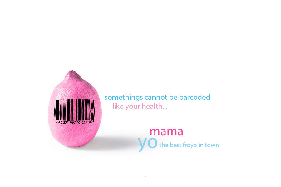
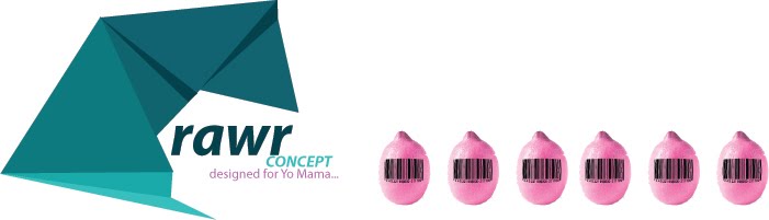
With this design, I have recreated the mascot for Yo Mama to induce a more child/teen audience to be attracted to this new brand of Fro-yo. The design retains the color scheme of Yo Mama however, and emphasizes once again its healthier properties than ice-cream.

Sunday 13 June 2010

Designs of Posters (Idea 2: Yo Mama Clouds)


The following designs go for a more creative and child oriented approach through using the idea of Fro-yo in clouds and color to convey to the audience what the Brand is really about: Having fun and fun through health. There is also an emphasis on the Yogurt's lower cholesterol levels and their avoidance to use artificial flavors and colors. Notice the change in the catch phrase in the 2 designs. Personally, i find both of them visually striking through the uses of the background cool and foreground/text warm colors which brings out the text.

Saturday 5 June 2010

Designs of Posters (Idea 1: Lemon Barcode)


Taking into account Yo Mama's emphasis for health in it's products, the following 3 design variations of a barcoded lemon reflect that exact need: to promote awareness that Fro-yo is a healthier option. These are initial designs and I have created them through the uses of Photoshop and Illustrator.